Despite what you’re selling, it’s safe to say that whoever your audience may be, they’re online multiple hours a day. Keep in mind, as much as a website can be a tool for your business, it can also hurt it. Your audience can differentiate (almost immediately) a website with poor production quality from one with great production quality. Your customers, like yourself, see them all day long.
Although there are millions of other things you’re focused on when starting a business – and your online presence may not be at the forefront of your initial priorities – it is undeniably an integral and highly important part of the first phase of your startup; creating a website is all about building your brand, creating awareness, and creating a home base for your company. Now, being that many newcomers are going to hear about you and want to search for you online, you need to impress them. This means you need to construct a website with high production quality. This means you need to keep up with the current startup web design trends.
Stationary Navigation
First and foremost is stationary navigation. Not that it’s startup-specific, stationary navigation is a great way to keep your main links directly before your audience despite how deep they venture. We’re all familiar with it, because it’s incredibly user-friendly. You can keep searching through whatever the website has to offer, perhaps an in-depth explanation of their product, and you’ll never have to look for that ‘buy it now’ link because it’s right in front of your face.Scrolling
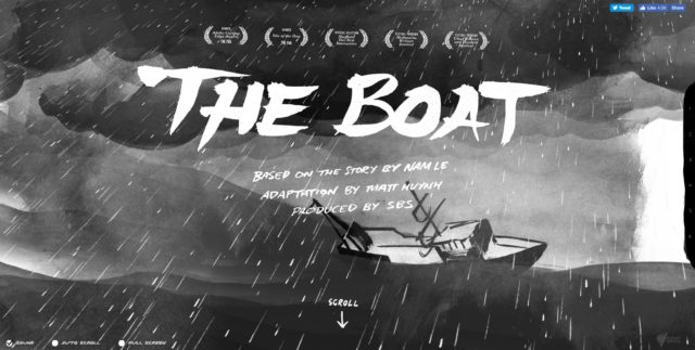
Scrolling. This has been largely impacted by phones and smaller tablets, as we all know scrolling through a page is a lot easier than clicking the miniature (in terms of larger screens versus the smaller ones of tablets) with your thumb or finger. It’s also easy on the eyes. You can take in the information at your own speed, passing graphic images or even stopping at a product-demo-video once in a while. Check out The Boat by SBS to see an incredible example of the power of scrolling.
Icons
Another web design trend is the use of icons. Icons present what would otherwise be a large body of information in a clear and concise form. Due to their small size and symmetry, you can convey more information using less. For instance, Peace Bicycles, a Dutch bike manufacturer, uses icons in their main navigation. The user-friendly menu compliments the fun, unique bike style and helps to set the brand’s website apart from competitors.Innovating UI Patterns
The purpose of perfecting the user interface (UI) on a website is for the platform to not only be user-friendly, but to adapt to the user as well. Meaning, a UI-first website is designed to guide the user along seamlessly and interact with them to satisfy their needs. Nowadays, there’s countless UI patterns used. Among these are a couple designs already mentioned like scrolling (short-scroll or long-scroll) and hero images. A hero image is basically a hlayoutsigh-definition banner image that serves as a backdrop for the company’s content. It’s the first thing an audience will see, and will sometimes remain stationary as the user scrolls. Others in this category are the hamburger menu, account harvesting (the websites that offer an account registration right of the bat) and card.Animation + Demonstration Videos
Animations and demonstration videos are becoming more and more popular too. Animations can be used to create motion and engage the user in a way that is more visual and entertaining (everything from picture slideshows, loading animations, scrolling visuals, and so forth). A demonstration video can consolidate a massive amount of information and deliver it in a concise and clear manner; these work especially well with product companies, as instead of relying on user-reading to understand the product and its value, they say ‘here, watch our quick video that has all you need to know!’Still not convinced animation can add something special to your site? Check out Panera Bread’s Land of Clean, an interactive experience with custom built animations.
Material Design
Material design is also being used as an alternative to flat design. It works well with UX (user experience) platforms, as it creates more depth by using shadows and contrast, and engages them further by creating more realistic images of what it is the company’s depicting. Material design gaining in popularity (especially with Google’s push to make it the standard of app design), and works well with adaptive design.Aside from the methods listed here, there are a lot of other web design trends both popular and gaining in popularity. On top of websites being important, design is the next priority. Not only is it the way your audience is going to interact with your company online, but the way in which you’re going to convey the thesis of what it is you are, and what you’re selling. Not only does a startup need a website but it needs to take its design seriously. Understanding and incorporating current design trends is a great place to start.
- Zac Johnson, tech.co


