

Sloppy hierarchies and chaotic color schemes are two design mistakes that can ruin your content. Nate Butler outlines eight design missteps and easy fixes that will improve your visual appeal.
Visual content is a crucial element in your content marketing. Whether it’s a one-off piece for social media or your latest company e-book, presentation is just as important as the content itself. We’ve talked a lot about the value of design, but that doesn’t mean any “designed” thing will do. Great design helps you stand out from the competition. Bad design leaves your readers confused and frustrated.
No One Said Visual Content Is Easy
To create compelling visual content, design should clearly communicate your ideas to your readers. The problem is, bad design sometimes makes things more confusing. When your audience can’t read your overly illustrated title, interpret the data, or get past an assault of color, your visual content will fail.After all the work you did to create the content, dropping the ball at this stage is unnecessary heartbreak.
In the spirit of learning and improving together, we’ve rounded up the eight most common design mistakes we see in bad visual content, along with their easy fixes. Keep an eye out for these issues in every piece of visual content you create, at every part of the design process. And may the design gods always smile upon you.

When you think visual content, always remember the content. Establish a coherent and obvious visual hierarchy to help guide your reader through. Otherwise, your message will get lost.
Pro tips:
- Anchor your visual on a main focal point. This point should help your reader quickly grasp what the most important part of your message is.
- Don’t include elements that distract from each other or compete directly with your focal point.
- Use negative space to your advantage. Sometimes a little breather and empty space can help guide the eye to where it needs to be.
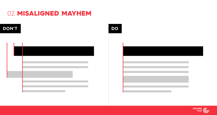
Laying out your visual content requires more than deciding what order you’re introducing information in or where you’re placing icons, visuals, and data. A misaligned visual typically results in a piece that looks sloppy or feels out of balance.
To avoid this, stick to a grid. These measurements will help you determine where to place everything as you build out your visual content.
Pro tips:
- The amount of space from the edge of your graphic should be consistent all around, especially where the header starts and the footer ends.
- Use consistent spacing between sections, and keep an eye out for headers and copy.
- Do a final alignment pass before you finalize.
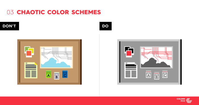
Colors can either bring your visual content to life or leave it in disarray. Ultimately, your brain can only handle so much, and color is a significant part of its visual processing. How often have you cringed at a neon infographic or strained your eyes to read colored type against a black background? Using color and using color well are two different things.
You can still play with color but always with the goal of enhancing your visual content. It should make content easier to understand, convey the tone of the information, and extend your brand’s visual language.Pro tips:
- Plan out your color scheme from the start. Use your brand colors (if applicable) or choose a color appropriate for the topic.
- Use one dominant color and two accent colors.
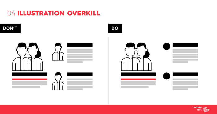
Just because we can doesn’t mean we should. This is especially true when it comes to illustration. Including too many characters or getting a little too fancy with your headers does no good. In design, it’s smart to question everything. If something doesn’t support or enhance your narrative, it doesn’t need to be there.
Use illustrations wisely and purposely. Remember, visuals should help you communicate with less words.
Pro tips:
- Resist the urge to include character illustrations without a specific purpose.
- Select a few key elements that would benefit the most from an illustration to help strengthen your overall message.
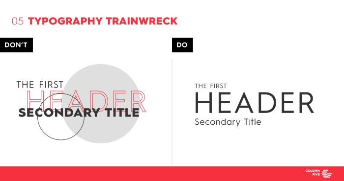
It’s easy to get carried away with type. There are so many pretty fonts! So many weights! So many opportunities to combine type and illustration (see above)! Great in theory, oftentimes bad in execution. Getting a little too creative by trying to place an image between a header and a subhead or using too many fonts throughout interrupts the flow.
Carefully laying out and presenting type is key. Both the placement and variety of fonts you choose impact the quality of your visual content.
Pro tips:
- Pick a single font family to work with.
- Don’t use more than three type styles within the same visual.
- Limit the amount of variation of weights and sizes for the fonts used.
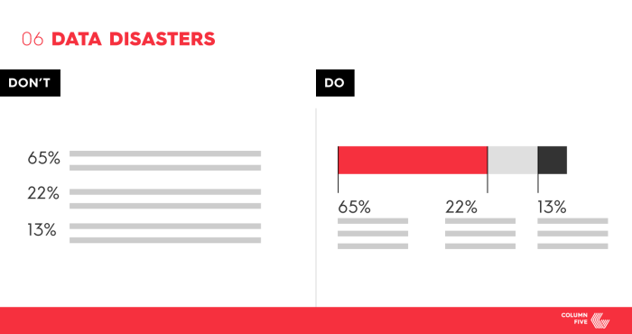
Using data to support your message is fantastic. But slapping a data point on a graphic doesn’t necessarily help that data make its impact. Far too often we see a great data visualization opportunity destroyed because the designer chose to simply list the data points. The only thing worse than that? Presenting an incorrect data visualization or making it appear skewed. Ensuring accurate representation and reliable data can make or break your visual content.
Pro tips:
- Check that chart labels and legends are consistent and legible.
- Ensure accurate scale and consistency.
- Don’t skew data through 3D charts or inaccurate comparisons.
- Instead of visualizing comparable data sets separately (e.g., three bar charts), combine them for easy comparison (e.g., one grouped bar chart). Do so only if appropriate.
- Check the primary source to ensure accuracy. Take a look at our best practices for sourcing data, too.
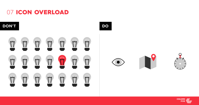
It can be tempting to use familiar icons to help communicate information in visual content. But when it’s overdone, it looks awkward, out of place, and worse, unoriginal. (How many times have we seen a light bulb icon representing “ideas”?) This is also true for data (see above). If 10 in 80 people do something, do not show 80 people icons to visualize that stat.
Use the overall theme and messaging in your graphic to help craft icons that relate directly to what you are saying. Similar to when using illustration, think through where you need icons and where you need words.
Pro tips:
- Avoid icons that are too on the nose (aka clichés) or completely unrelated to the subject at hand.
- Use a consistent illustration style. Otherwise, they’ll look cobbled together from clip art.
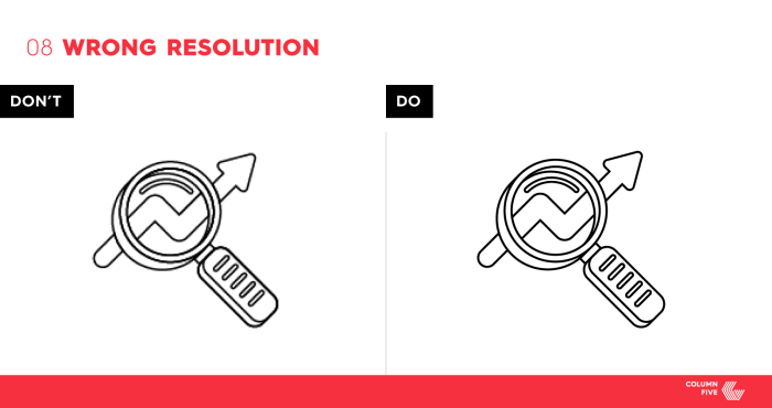
Visual content comes in many forms and is published in many different ways. Whether it’s for print or web, make sure you have the right resolution for your format. Account for advances in tech, like retina screens, and any other specifications.
Know your specs from the get-go, including size and resolution.
Pro tips:
- For retina, save images at twice the size.
- Deliver final files in multiple formats and sizes, if needed (e.g., a full infographic and a single Facebook-sized panel for promotion).
Your Visual Content Checklist
Always design for your message and, again, question everything. At every stage, use this handy checklist to make sure you’re designing the best, most effective piece.Checklist:
- Color: Stick to the few colors within your color scheme.
- Alignment: Stay consistent with similar elements throughout the graphic.
- Hierarchy: Lead your reader’s eye through your work.
- Illustrations: Make sure they complement content, not overpower.
- Typography: Use one font family, three type styles and consistent weights and sizes throughout.
- Data: Visualize where appropriate, avoid redundancy, and present the data in the most compelling format.
- Icons: Use icons that are clear and unique to the information you are presenting.
- Format: Know where your work will live, and optimize it for that platform.
- Courtesy of ColumnFiveMedia